Tag Archives: dc

So Cliché

Glenn Fry, Snap out of it, hand-pulled serigraph on paper, 38” x 30,” edition of 8. Courtesy of Gallery Plan B.

Glenn Fry, Snap out of it, hand-pulled serigraph on paper, 38” x 30,” edition of 8. Courtesy of Gallery Plan B.

Serigraphs by Glenn Fry
Gallery Plan B

1530 14th Street
Wed – Sat 12pm-7pm Sun 1pm-5pm

Sometimes it seems that the art world has become so jaded that it can only accept work that is depressing and antagonizing. This is not entirely the fault of art professionals; there is a lot in the world that is antagonizing and depressing, and artists as observers tend to notice the problems that exist in this world in a more acute way. Glenn Fry is a rebel against this tradition. Glenn Fry might even be labeled an optimist. It is not that Fry’s work denies the evils and temptations that threaten human existence, but he still has faith in humanity’s ability to overcome such obstacles.

In his current exhibition, Serigraphs by Glenn Fry at Gallery Plan B, Fry presents to us a collection of hand-pulled serigraphs, which look like a combination between advertisements and inspirational college dorm posters. Although it might look like Fry has taken his images from old ads, he actually carefully stages each work with models and then photographs them. Fry then pairs these carefully constructed compositions with his own words. Snap out of it is an image of a young black man wearing a suit and tie, snapping his fingers. The man is blue, the background is brown and orange with a small stripe of bright green in the upper right for balance, the word “snap” is yellow (according to the rules of design this is always the first color we see) and the rest of the text is black. The image is taken from below, making the man seem authoritative and confident. His expression is intense, but concerned and kind. Fry uses every design and advertisement rule in the book, but instead of manipulating us into buying things Fry uses the rules to reach out and offer a friendly slap in the face.

It would be easy to discard Fry’s prints as cheap corporate attempts to make some corny cash… if they were sold in a bookstore. The time and effort put into each of these hand-crafted prints, coupled with the fact that they are exhibited in a gallery, are crucial to classifying these works as fine art. The artist Marcel Duchamp made the point that exhibition in a gallery elevates objects to a godly status that they would not otherwise possess. Most art critics have always believed that this is a bad thing, but in fact, the position that the gallery holds is very important and can be used for good. Love is a framed print that contains a red heart with the word “love” in yellow letters on a gray background. This is a prime example of how Fry’s works share knowledge that might otherwise be written off as cliché and intuitive: many times when we are deep in our own worlds, we lose track of the fact that we do frame “love,” and put it on a wall, and never consider what that means. Duchamp put a shovel in a museum and called it art to remind us that even a shovel has beauty and deserves reflection—Fry offers cliché moments.

-Ophra Paul

Serigraphs by Glenn Fry is on view at Gallery Plan B until July 18.

Creation

Untitled (gestation). 2008-09, 100 hand-carved alabaster sculptures, dimensions variable. Photo by Brandon Webster.

Untitled (gestation). 2008-09, 100 hand-carved alabaster sculptures, dimensions variable. Photo by Brandon Webster.

Ami Martin Wilber: gestation
Flashpoint
916 G Street NW
Tuesday—Saturday, 10—6pm

Ami Martin Wilber’s recent show gestation at Flashpoint features one hundred alabaster stones installed directly on the floor to form a circle. The gallery is fairly dark upon entering as the installation is lit by a single light. The word gestation refers to the carrying of an embryo inside a female animal’s body, otherwise known as pregnancy. Wilber worked daily on the stones and completed them over a period of nine months.

Untitled (gestation) encourages both movement and mediation. Visitors are encouraged to sit down on the floor to observe the work. The minimal installation also allows visitors to comfortably move throughout the space to view the work from different parts of the gallery.

From a position on the floor, the stones appear to be light, cloudlike and closely positioned. This view emphasizes the installation as a whole and the layered texture of the stones created by the Wilber’s arrangement. However, standing beside the installation and looking downwards drastically changes the texture of the stones. From this position the space between each stone becomes part of the sculpture and the irregularities in the material are emphasized. For instance, all the stones initially appear to be same soft white, but different tones of gray, pink and brown emerge.

Wilber’s installation is remarkably beautiful and, overall, encourages a peaceful, contemplative state. Wilber, however, creates a tension by making the stones rather approachable. The approximately 5 x 3 inch size of each provokes the childlike desire to grab a stone and disturb the order of the work.

At the front of the gallery, Wilber also has several small drawings on view, which replicate the shapes found in Untitled (gestation). Like the installation, the repetition of shapes suggests order but the drawings are not exact. The implied movement found in the installation also appears in the drawings.

Wilber’s installation succeeds when given ample amount of viewing time. Like her process of working, the installation requires a patient and thoughtful approach and, fortunately, Flashpoint quietly caters to this method.

-Alison Reilly

Ami Martin Wilber: gestation is on view at Flashpoint until July 18.

Thick Skin

Paint Made Flesh
The Phillips Collection
1600 21st Street, NW
Tue- Sat 10am-4pm (Thur 8:30pm) Sundays 11am-6pm

The body has traditionally been used as a symbol in painting, often representing spirituality, idealized beauty and power. Paint Made Flesh, an exhibit put together by the Frist Collection, which is resting at the Phillips Collection in DC for the summer, highlights a different side of humanity, the dark conflicted and anxiety plagued side. The show is comprised of works by a multitude of artists who painted between the 1950s and the present day. The show is divided by themes, time periods and locations, making it difficult to decide where Modern ends and Contemporary begins.

Lucian Freud, Naked Man,

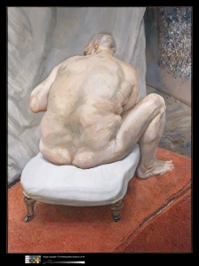
Lucian Freud, Naked Man, Back View, 1991–92, Oil on canvas, 72 1/4 x 54 1/8 in. (183.5 x 137.5 cm). Courtesy of the Metropolitain Museum of Art, Purchase, Lila Acheson Wallace Gift, 1993 (1993.71).

Although the two Lucian Freud’s date from 1988-89 and 1991-92, they are still very relevant and noteworthy. Freud painted from life over long periods of time and favored friends over professional models; he wanted to portray people as they are, not as they are posed to be. Hailing from the Tate Modern, Standing by the Rags is a magnificent portrait of painter Sophie de Stempel, who worked with Freud for eight years and modeled for him frequently. She is half lying, her body resting on a giant pile of Freud’s painting rags and half standing, her feet planted solidly on the hardwood floor. The perspective leans upwards and only a glimpse of a wall helps to anchor the space. De Stempel’s head rests on her right arm, which is arced over a bulge in the pile, cradled as if there were another person lying with her. Her gesture and facial expression seem to exude a comfort and trust that only close friends can have, but she does not have complete confidence in the stability of Freud’s rags and keeps her feet firmly on the ground. The second Freud painting depicts the controversial performing artist Leigh Bowery. Bowery’s back is turned and a curtain blocks the view into the studio, revealing only the distant wall that Freud used as a palette—these compositional choices speak of a more guarded relationship.

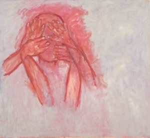
Susan Rothenberg, Crying, 2003, Oil on canvas. 58 1/2 x 63 1/2 in / 148.6. Courtesy of Waddington Galleries. x 161.3 cm

Susan Rothenberg, Crying, 2003, Oil on canvas. 58 1/2 x 63 1/2 in / 148.6. Courtesy of Waddington Galleries. x 161.3 cm

Susan Rothenberg and Tony Bevan paint expressively and reduce narratives to articulate deep, focused feelings of stress and tension. Rothenberg’s “Crying,” an entirely red and white painting—her most frequent colors, because of their fleshy human qualities—depicts a head and neck covered by four hands that seemed to have wiped any recognizable features off the face. The face, hands and arms are red and disembodied, and they emerge from the upper left through a white background that has been layered over red. The work captures the haze and wearing nature of depression. Bevan also uses red and white but in a more restrained aesthetic. The red lines that scar and illustrate “Head” seem to be abstract and cluttered up close, but from far away describe strained, stretched, balloon-like face from a skewed upwards perspective. The face seems to float away, falling apart and coming back together on upon each viewing expressing the struggle to maintain clarity in this complicated world.

Jenny Saville, Hyphen, 1999. Private Collection, Courtesy of Gagosian Gallery. © Jenny Saville

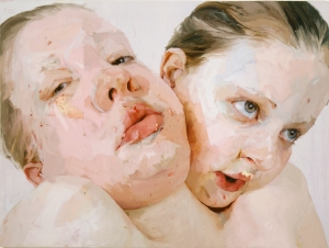
Jenny Saville, Hyphen, 1999, Oil on canvas. Private Collection, Courtesy of Gagosian Gallery. © Jenny Saville

John Currin, The Hobo, 1999, Oil on canvas. Courtesy of the Museum of Contemporary Art San Diego.

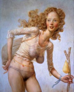
John Currin, The Hobo, 1999, Oil on canvas. Courtesy of the Museum of Contemporary Art San Diego.

Jenny Saville and John Currin are both technically accomplished painters who deal with female beauty from totally different perspectives. Saville moved around a lot as a child, always having to adjust to a new location and new people. She sees herself as an outsider and is attracted to unconventional body types. Her studies with a plastic surgeon led to a discovery of the ‘object-ness’ of flesh, and its ability to be sculpted and manipulated, strangely similar to paint. She confronts and embraces her anxieties about being different with monumental paintings, often self-portraits, which have been built up with large areas of paint layered with a roller. “Hyphen” is a double portrait of the artist and her sister, who is resting her head on Saville’s shoulder. Saville’s eyes seem to dare anyone to judge her, effectively guarding herself and her sister—who stares hesitantly but hopefully into the distance—from the harsh world. By contrast, John Currin embraces the long history of objectifying the female figure in his satirical, campy and playfully hedonistic paintings. He celebrates the ridiculousness of the obsession with a perfect female form in “Nude with Raised Arms,” daring his audience to try look away and to decide whether this smooth creamy young body emerging from a milky blackness is Venus, pornography or both. Even more bluntly camp, “The Hobo” makes fun of the way that everyone, even destitute, downtrodden people, are inexplicably beautiful on bad television. Currin does not accept any guilt for his pleasures but instead dutifully recognizes and embraces the beauty and depravity that seem inexorably intertwined in his view of the world.

Daniel Richter, Duisen, 2004, Oil on canvas, Image Size: 106 1/4 x 137 3/4 inches. Courtesy of David Zwiner Gallery.

Daniel Richter, Duisen, 2004, Oil on canvas, Image Size: 106 1/4 x 137 3/4 inches. Courtesy of David Zwiner Gallery.

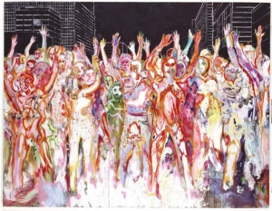
German painter, Daniel Richter is concerned with music, current events, and graffiti culture. The craze that overtakes people when they take drugs and infrared pictures inform Richter’s style and present the point of view of “the paranoid westerner,”* a group which he confrontationally and bravely confesses to be a part of. Richter turns current tragic and violent news events into ambiguous paintings that could be read as celebrations. Using neon energetic colors, he layers the complications of living comfortably as part of first world culture while being surrounded by economic, environmental and military problems, both domestic and foreign. “Duisen” is a painting of a crowd of people with upraised arms, who are melting in violent Technicolor in a black cityscape background. They look as if they could be part of a rave at a concert or victims of some as yet unknown bio-weapon. Duisen is a made-up word that is play between the German words that mean millions and south. Richter is referencing the influx of immigrants to Germany from southern countries, bringing with them political, social and economic upheaval.

Paint Made Flesh includes superlative examples by artists Alice Neel, Francis Bacon, Julian Schnabel, Richard Diebekorn and De Kooning and many others that have come from first-rate museums around the world. The Frist has brought together a phenomenal group of paintings but do not expect to find bucolic and carefree works. This is a challenging exhibit that brings together many different stressful concepts and events. If you leave feeling stressed and overwhelmed than the show did exactly what it intended to do.

-Ophra Paul

Paint Made Flesh is on view at the Phillips Collection until September 1st.

*Schatz, Matthias. “Paranoid Westerner” Daniel Richter Paints Crowds, Harlequins, Terror.” Bloomberg.com (July)

**Although I currently work at The Phillips Collection as a Museum Assistant I was not involved with the planning or implementation of Paint Made Flesh. I am not a Phillips Collection spokesperson; I take personal responsibility for this article.

Child’s Play

KENNY HUNTER: LIKE WATER IN WATER, NATHANIEL ROGERS: THE LAST VIKING
Conner Contemporary
1358-60 Florida Ave
Wed-Sat 11am – 5pm

Conner Contemporary Art currently has two shows up in its large space: Kenny Hunter’s Like Water in Water and Nathanial Rogers’s The Last Viking. Both shows are full of sarcasm about, and witty criticism of, contemporary society. Although the shows are presented as separate entities they both use the guise of childlike innocence to tackle large intimidating issues. Hunter and Rogers force us to face our fears by tricking us into confrontation.

Kenny Hunter Like Water in Water 2009, resin, jesmonite, steel, paint, 35.43 x 59.06 x 23.62 inches. Photo courtesy of Conner Contemporary Art.

Kenny Hunter, Like Water in Water, 2009, resin, jesmonite, steel, paint, 35.43 x 59.06 x 23.62 inches. Copyright Kenny Hunter, courtesy Conner Contemporary Art.

Kenny Hunter’s sculptures are pointedly unreal; they replicate the smooth and perfect aesthetic of caricatures and dolls. In this show, Hunter’s work addresses the human driven destruction of our planet. The sculpture after which the exhibit was titled, Like Water in Water, is a life size deer cast in resin and painted in a soft matt tan. The deer is stepping through a tire and some metal lily pads, which are a few inches off the ground thereby communicating that the visitors to the gallery and the deer are walking through a few inches of ‘water.’ The deer looks welcoming and approachable but after a few moments the realization materializes that this piece is a comment on the environment. Like the deer, we are a few inches deep in trouble.

Kenny Hunter, End Product, 2009, jesmonite, 21.65 x 21.65 x 21.65 inches 55 x 55 x 55 cm, Edition of 3. Copyright Kenny Hunter, courtesy Conner Contemporary Art.

Kenny Hunter, End Product, 2009, jesmonite, 21.65 x 21.65 x 21.65 inches 55 x 55 x 55 cm, Edition of 3. Copyright Kenny Hunter, courtesy Conner Contemporary Art.

Similarly, with End Product, an unpainted trash bag, we are met by what seems to be a banal, unassuming piece. At second glance it is realized that the paint brushes, coffee cup and banana peel that have leaked out of a hole in the bottom of the bag are a representation of the artist himself. This self-deprecating self-portrait not only heralds the artist’s own ironic participation in the destruction of out planet but imposes itself as a mirror on the viewer.

Rogers, Nimble Jack, 2009, oil on panel, 8 x 6 inches, 20.3 x 15.2cm. Images are copyright Kenny Hunter, courtesy Conner Contemporary Art

Nathaniel Rogers, Nimble Jack, 2009, oil on panel, 8 x 6 inches, 20.3 x 15.2cm. Images are copyright Kenny Hunter, courtesy Conner Contemporary Art

Nathaniel Rogers’s works uses nursery rhymes depicted in a hyper-realistic style (that any children’s book editor would covet) to address deeply disturbing psychological issues. Most of the nursery rhymes we learned as children actually were created to remember specific, usually distressing, historical events or social issues. They often were not meant for children but for adults to joke and spread gossip. In most cases the actual meaning of the poems was lost and they instead live on as meaningless entertainment. Rogers once again utilizes these catchy rhymes to talk about cultural affairs. The poem “Jack be Nimble” refers to the sport of jumping over candles—a considerably safer version of an earlier sport of jumping over bon fires. Jack is often thought to be the pirate Jack Black who was notorious for escaping from authorities. Rogers’s Nimble Jack is a commentary on self-destruction and medication. His Jack is kneeling in a bedroom, wearing an eye-patch and holding a miniature version of himself over the candle. On the dresser behind Rogers’s Jack are two empty pill bottles and the expression on Jack’s face is obviously disturbed.

Nathaniel Rogers, Jack Horner (The Last Viking), 2009, oil on panel, 6 x 8 inches, 15.2 x 20.3 cm. Images are copyright Kenny Hunter, courtesy Conner Contemporary Art.

Nathaniel Rogers, Jack Horner (The Last Viking), 2009, oil on panel, 6 x 8 inches, 15.2 x 20.3 cm. Images are copyright Kenny Hunter, courtesy Conner Contemporary Art.

In another painting, Jack Horner (The Last Viking), Rogers addresses the poem “Little Jack Horner.” The poem retells the story of the steward to the Bishop of Glasbury. The Bishop was trying to bribe King Henry VIII and Thomas Cromwell not to destroy his Abbey and steal the treasures inside. The Bishop sent the deeds to twelve English manorial estates hidden in a pie and had the trusted steward Horner deliver them. Horner, in turn, sat on the jury that convicted the Bishop of treason for being loyal to Rome and either stole, or was rewarded with the deeds to the estates. Rogers, interestingly chose himself as the model for Horner; he is wearing a Viking hat, and sitting on a lawn with a stone wall to his back, a dresser at his left and a burning model of a monastery is resting on top of a box marked ‘fragile’ in the foreground.

Conner Contemporary’s choice to exhibit these two artists work at the same time seems appropriate despite there differences in media and subject matter. By easing the viewer into their choice of subject matter, and using comforting familiar imagery the artists are able to create dialogue about often unaddressed and purposefully ignored subjects. Although Conner Contemporary is a little difficult to get to without a car, their space is great and this show makes the trip well worth the bus ride.

-Ophra Paul

KENNY HUNTER: LIKE WATER IN WATER, and NATHANIEL ROGERS: THE LAST VIKING are on view at Conner Contemporary Art until July 25.

Best of Artomatic

Artomatic
55 M Street, S.E. 
Sun, Wed, Thu 12– 10pm, Fri and Sat 12– 1am

Artomatic, a non-profit, month-long art festival, is celebrating its tenth year filling unused Washington, DC office space with art. This year at 55 M Street, Artomatic has filled eight floors of office space with work by over 1000 visual artists. There is no jury or curator for Artomatic, and anyone can register. This means there are a lot of artists exhibiting in Artomatic whose goals are not to create contemporary fine art, and many who would like to meet that definition, but fall short. In this plethora of art, there are some jewels that should not be overlooked.

Jamie Wimberly, “Turn Off The Lights At The Tate,” Mixed Media, 2008. Photo courtesy of the artist.

Jamie Wimberly, “Turn Off The Lights At The Tate,” Mixed Media, 2008. Photo courtesy of the artist.

Jamie Wimberly’s “Box Icon Series” consists of small personal altars made of cabinets, wood boxes and deep-set frames that contain objects of contemporary adulation. Often the boxes include votive candles and visual and verbal puns. These altars satirize the things society worships, in particular the female nude, which is one of the most popular subjects at Artomatic. Wimberly’s current project, “Provocations,” which he is showcasing at Artomatic, addresses the excesses and influences of the contemporary art market. One of these “Provocations” contains a votive candle, parted white curtains, a nude female and a dollar bill and is titled, “Gagosian.” This piece shares its name with the notable, Larry Gagosian and his superstar gallery who have had tremendous influence over the art world and what becomes contemporary art. Another work titled “Turn Off the Lights at the Tate” features votive candles, a metal plate that says ‘TATE,’ delicate white partitioned curtains, light switches on a background of deep red wax flowers, and a female nude thinking the word ‘off’ while her arms are braced over her face. The woman seems to be begging for some privacy from the thousands who walk through The Tate Modern every day, scrutinizing the female nudes that have literally become objects forever. The irony is that in creating this satire, Wimberly has once again objectified the female nude.
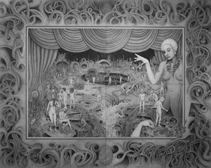
Ben Tolman, The Theatre, 80 x 64 in., ink on board, 2007-2008, Photo courtesy of the artist.

Ben Tolman, The Theatre, 80 x 64 in., ink on board, 2007-2008, Photo courtesy of the artist.

For Artomatic, Ben Tolman printed a reproduction of his work, “The Theater,” an 80 x 62 inch piece that looks like a modernized version of Hieronymus Bosch’s “Earthly Delights,” one of Tolman’s favorite paintings. Tolman’s ink drawings are very intricate, and he only completes about three per year—“The Theater” took nine months to complete. Whenever Tolman begins a new project he starts with a rough idea in mind and does a light sketch in ink of the complete composition. After completing the sketch, he concentrates on individual areas allowing the arrangement and focus to mature organically as he moves throughout the image. The resulting works capture the viewer, refusing release until the entire picture has been taken in. In a large drawing like “The Theater,” this can take some time, so Tolman provided chairs in front of his booth at Artomatic. Also featured at Tolman’s space at Artomatic is a print of a drawing that Tolman completed with artist Lars Peterson as part of the Antipodes project. Antipodes is a collaborative that Tolman started between artists around the world. The collaborative creates large-scale drawings through the mail, each artist adding to the drawing and then sending it to the next artist. A portrait by Tolman will be featured at The National Portrait Gallery as part of their Outwin Boochever Portrait Competition.

Michelle Herman, Applied Research & Technology (installation view, 2008), video and science equipment, 2008. Photo coutesy of the artist.

Michelle Herman, Applied Research & Technology (installation view, 2008), video and science equipment, 2008. Photo coutesy of the artist.

The collection of science equipment on floor two of Artomatic is the work of Michelle Herman. Her 16mm films are derived from Herman’s study of “Decalcomania,” a painting technique that involves pressing two surfaces together with pigment between them and then pulling them apart, leaving fractal, textured patterns behind. Herman’s videos show the way the ink spreads and moves in water, never repeating the same pattern. The video is displayed on a piece of equipment that looks like it belongs in a science lab, and the video itself looks more like an organism growing and changing than ink blots. Herman is very interested in the way certain bacteria take on the look of ‘decalcomania.’ Herman’s videos are her way of visualizing the controlled chance that exists in nature, in art and life in general. Herman also invites the visitor to participate in her ‘experiments’ by looking through a microscope, which is attached to a live feed camera that displays the unsuspecting visitor’s eye on a screen on the table.

Elizabeth Crisman, Untitled 4, silver gelatin print, 2008. Photo courtesy of the artist.

Elizabeth Crisman, Untitled 4, silver gelatin print, 2008. Photo courtesy of the artist.

Elizabeth Crisman restructures elements of the human body and creates new large-scale compositions. By stitching together parts of the male and female body that she photographed, she addresses the psychological, as well as physical effects of the recent trend to transform the body though various medical procedures. In another series Crisman scans or photographs x-ray transparencies, rearranges them onto photosensitive paper and exposes the arrangement as a photogram. Interestingly, the sources for her compositions are completely anonymous, as the transparencies were purchased on eBay.

Tim Tate, I See Myself in a Hollywood Movie, 2008. Photo courtesy of the artist.

Tim Tate, I See Myself in a Hollywood Movie, Mixed media, 2008. Photo courtesy of the artist.

Encased in glass like tiny specimens, Tim Tate’s “Video Reliquaries” are deeply enchanting. Each round bubble of glass encloses a tiny video screen and is topped with a small glass sculpture. The smallness of the screen demands an intimate distance from the work, forcing a feeling of deep voyeurism that is most unnerving, particularly in Tate’s “I See Myself in a Hollywood Movie,” a closed circuit video that captures the viewer on the screen. The sculpture topping the piece is an old movie projector. Down beside “I See Myself in a Hollywood Movie,” is a red button that when pressed repeats Gloria Swanson’s famous line in the movie “Sunset Boulevard”—in a gruff voice so soft you have to lean in close to hear—”I’m big… it’s the movies that got small.” This work brings home the absurdity of the reality TV, fame obsessed culture we live in. Tate allows every visitor to be a star (if only on the small-screen), a desire that most participants in Artomatic seem to crave desperately.

J.T. Kirkland, Untitled, Construction-grade plywood, 96" x 144" x 1/2," 2009. Photo courtesy of the artist.

J.T. Kirkland, Untitled, Construction-grade plywood, 96" x 144" x 1/2," 2009. Photo courtesy of the artist.

There are very few artists who believe that less is more; even in this bare-bones economy, most contemporary artists (and definitely Artomatic artists) seem to have a Rococo ornamental sensibility. J.T. Kirkland’s installation at Artomatic offers an elegant critique on this subject. Kirkland did not add anything to the plywood wall of his Artomatic space. Instead, he drilled shallow holes in the board, using smaller bits toward the center, focusing attention on the surface itself as opposed to anything adorning it. Kirkland’s work is also a component of a collaborative project at Artomatic called “Space Between.” The project features three artists with similar aesthetic sensibilities who are inspired by each other’s work. The project is still in its initial stages, but it will be interesting to follow as it develops.
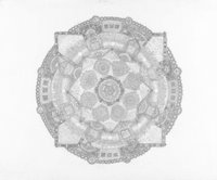
Corwin Levi, Mandala, ink and pencil on paper, 30x22, 2002. Photo courtesy of artist.

Corwin Levi, Mandala, pencil on paper, 30x22, 2002. Photo courtesy of artist.

Corwin Levi’s drawings provide an intimate look into the workings of his mind. The drawings are astonishingly intricate and take a long time complete. Levi may start out with a few particular ideas but continues to express new thoughts and experiences that accumulate throughout his process. According to the artist, “each piece is both a video and a frame.” They express the time period up till and throughout the completion of the work while at the same time remaining frozen artifacts. The intricate patterns provide a steady composition, but at a closer look, the elements within the patterns contain irregularity and diversity. The components of each drawing must be viewed individually in order to fully appreciate their detail, and stepping back to take in the whole means the losing those details. This can be likened to an attempt to understand a person; it is impossible to understand the whole without losing the intricate details that compose the individual.

Eric Celarier, Untitled, mixed media. Photo courtesy of Katie Bechtold.

Eric Celarier, Untitled, mixed media. Photo courtesy of Katie Bechtold.

Eric Celarier sews small computer parts and circuit boards together to create intricate quilts. His overall design gives the illusion of an aerial perspective of a highly organized and structured city; however, the details of his stitching provide evidence of a human presence in the quilt. By sewing the metal parts on the fabric, Celarier renders the quilt useless in the functional sense, but calls attention to his choice of often disposed and overlooked material.
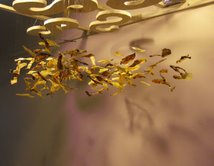
Alexandra Zealand, Flock, Grapefruit pith, string and wood. Photo courtesy of the artist.

Alexandra Zealand, Flock, Grapefruit pith, string and wood. Photo courtesy of the artist.

Alexandra Zealand, a sculptor, collects discarded materials including coffee filters, matchsticks, and most recently grapefruit pith. With these materials she explores the human desire to prolong time until death. In her installation at Artomatic, Zealand hung small pieces of dried pith to form a cloudlike sculpture. The delicate structure sways with the slightest movement, and the individual pieces are especially engaging because of their texture and their range in color.

Since there is no curator or jury at Artomatic, there is a lot of kitsch and decorative art. This is not a bad thing, but it is unfortunate that Artomatic is not also thought of as an incubator and a stage for emerging fine artists. In looking at art in this space, it becomes necessary to imagine what an individual piece of art would look like in a gallery or museum in order to contextualize it and decide if it would belong. This tool could also be used the other way around when visiting galleries; imagining a particular work in a space like Artomatic can help diffuse the aura of the gallery and make an accurate decision about the aesthetic merits of the piece.

Ophra Paul and Alison Reilly

Artomatic will be on view at 55 M St. until July 5th.